上一篇
如何通过CSS实现常见网站布局?
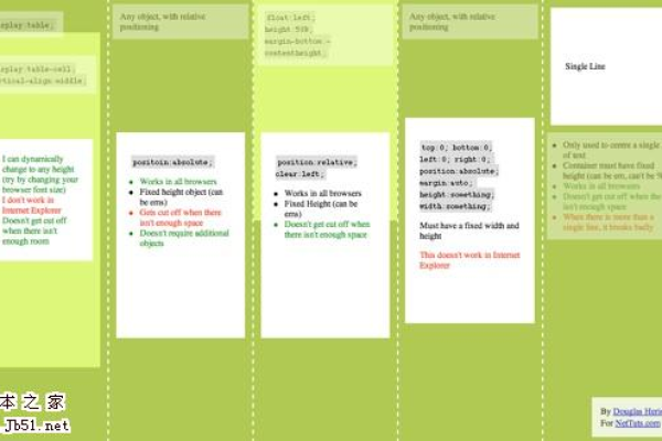
本文归纳了四十二种CSS常见布局,涵盖水平居中、垂直居中等多种方式,并通过实例代码展示其应用。
CSS 是网页设计中不可或缺的一部分,它不仅能够定义颜色、字体和间距等样式,还能实现各种复杂的网页布局,以下是一些常见的 CSS 网站布局实例及其详细代码解释:

1、水平居中
:适用于行内块级元素,通过为其父元素设置text-align: center; 来实现水平居中。
     <div >
       <div ></div>
     </div>
     .parent {
       background: #ff8787;
       text-align: center;
     }
     .child {
       display: inline-block;
       height: 300px;
       width: 300px;
       background: #e599f7;
     }
:适用于定宽的块级元素,直接对子元素设置margin: 0 auto; 即可实现水平居中,但需注意设置宽度。
     <div >
       <div ></div>
     </div>
     .parent {
       background: #ff8787;
     }
     .child {
       width: 300px;
       height: 300px;
       margin: 0 auto;
       background: #e599f7;
     }
:适用于开启定位的元素,通过设置left: 50%; 和transform: translateX(-50%); 来实现水平居中。
     <div >
       <div ></div>
     </div>
     .parent {
       position: relative;
       background: #ff8787;
     }
     .child {
       position: absolute;
       left: 50%;
       transform: translateX(-50%);
       height: 300px;
       width: 300px;
       background: #e599f7;
     }
:通过设置父元素的display: flex; 和justify-content: center; 来实现水平居中。
     <div >
       <div ></div>
     </div>
     .parent {
       height: 300px;
       display: flex;
       justify-content: center;
       background: #ff8787;
     }
     .child {
       height: 300px;
       width: 300px;
       background: #e599f7;
     }
:通过设置父元素的display: grid; 和justify-items: center; 或justify-content: center; 来实现水平居中。
     <div >
       <div ></div>
     </div>
     .parent {
       height: 300px;
       display: grid;
       justify-items: center;
       background: #ff8787;
     }
     .child {
       height: 300px;
       width: 300px;
       background: #e599f7;
}2、垂直居中
:适用于行内块级元素,通过为父元素设置line-height 等于其高度,并让子元素设置为inline-block 和vertical-align: middle; 来实现垂直居中。
     <div >
       <div ></div>
     </div>
     .parent {
       line-height: 500px;
       background: #ff8787;
     }
     .child {
       display: inline-block;
       vertical-align: middle;
       width: 300px;
       height: 300px;
       background: #91a7ff;
     }
:适用于块级元素,通过设置top: 50%; 和margin-top: -150px;(其中150px 是子元素高度的一半)来实现垂直居中。
     <div >
       <div ></div>
     </div>
     .parent {
       position: relative;
       height: 500px;
       width: 300px;
       margin: 0 auto;
       background-color: #ff8787;
     }
     .child {
       position: absolute;
       top: 50%;
       margin-top: -150px;
       width: 300px;
       height: 300px;
       background-color: #91a7ff;
     }
:通过设置父元素的display: flex; 和align-items: center; 来实现垂直居中。
     <div >
       <div ></div>
     </div>
     .parent {
       display: flex;
       align-items: center;
       height: 500px;
       width: 300px;
       margin: 0 auto;
       background-color: #ff8787;
     }
     .child {
       width: 300px;
       height: 300px;
       background-color: #91a7ff;
     }
:通过设置父元素的display: grid; 和align-items: center; 来实现垂直居中。
     <div >
       <div ></div>
     </div>
     .parent {
       display: grid;
       align-items: center;
       height: 500px;
       width: 300px;
       margin: 0 auto;
       background-color: #ff8787;
     }
     .child {
       width: 300px;
       height: 300px;
       background-color: #91a7ff;
}3、水平垂直居中
:适用于已知宽高的元素,通过设置position: absolute;、top: 50%;、left: 50%; 以及margin-top 和margin-left 为负值的一半来实现水平垂直居中。
     <div >
       <div ></div>
     </div>
     .parent {
       position: relative;
       background: #ff8787;
     }
     .child {
       position: absolute;
       top: 50%;
       left: 50%;
       width: 200px;
       height: 100px;
       margin-top: -50px;
       margin-left: -100px;
       background: red;
     }
:通过设置父元素的display: flex;、justify-content: center; 和align-items: center; 来实现水平垂直居中。
     <div >
       <div ></div>
     </div>
     body, html {
       height: 100%;
       margin: 0;
       padding: 0;
       display: flex;
       justify-content: center;
       align-items: center;
       background: gray;
     }
     .child {
       width: 200px;
       height: 100px;
       background: red;
     }
:通过设置父元素的display: grid; 和place-items: center; 来实现水平垂直居中。
     <div >
       <div ></div>
     </div>
     body, html {
       height: 100%;
       margin: 0;
       padding: 0;
       display: grid;
       place-items: center;
       background: gray;
     }
     .child {
       width: 200px;
       height: 100px;
       background: red;
     }
:通过设置父元素的display: table-cell;、vertical-align: middle; 和text-align: center; 来实现水平垂直居中,需要注意的是,display: table-cell; 时padding 会失效,display: table-row; 时margin、padding 同时失效,display: table-cell; 时margin 会失效,因此需要将子元素放在一个额外的容器中来设置外边距。
     <div >
       <div ></div>
     </div>
     .box {
       display: table;
       width: 600px;
       height: 300px;
       background: red;
       text-align: center; /* 水平居中 */
       vertical-align: middle; /* 垂直居中 */
     }
     .child {
       display: inline-block; /* 解决 margin 失效问题 */
       margin: 0 auto; /* 水平居中 */
       width: 200px;
       height: 100px;
       background: lightblue;
} 本站发布或转载的文章及图片均来自网络,其原创性以及文中表达的观点和判断不代表本站,有问题联系侵删!
本文链接:http://www.xixizhuji.com/fuzhu/400580.html
相关文章
-
如何通过CSS元素样式控制优化网站布局?
-
如何通过CSS实现网页元素的垂直居中布局?
-
如何利用DEDECMS实现个性化文章标题+栏目名称+网站名的网站布局?
-

CSS网页布局实例,这12种常见网页布局你都掌握了吗?
-
在网页布局中,DIV(Division)标签被广泛用于创建文档的结构化部分。通过CSS样式,我们可以对DIV的位置进行精确控制,从而实现复杂的页面布局和设计。那么,如何设置DIV的位置呢?以下是一个疑问句标题,,如何利用CSS精准定位HTML中的DIV元素?
-
如何通过CSS使用绝对定位和浮动技术实现网页的分栏布局?
-
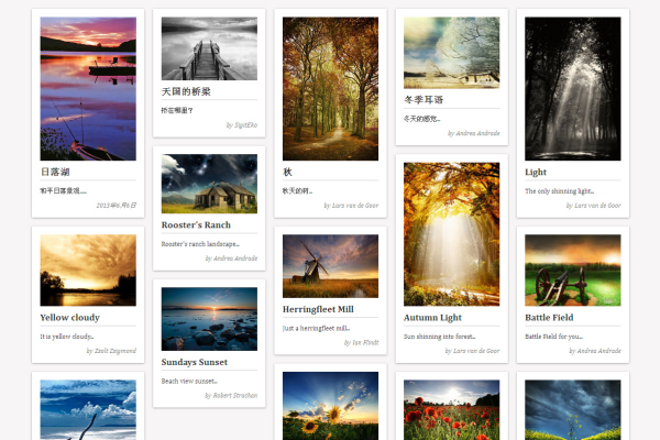
如何实现一个响应式瀑布流网站布局?
-
如何通过CSS实现三列固定布局的网页设计?
-
如何修改DedeCMS模板路径以优化网站布局?